
GOODLIFE
This hand lettered masthead was created for a publication based in the Netherlands who wanted to be a challenger brand to Vogue and Tatler.


SUNSET OVER LEIGH
I have a keen interest in photography, so whether it's with my Panasonic GX7 or my iPhone, I'll endeavour to capture the moment.


LINNETT & PRICE
A brand band identity for a new and up coming duo, Linnett and Price, with their initials making their signature ampersand. The idea is that the ampersand stays consistent, while the other elements of the identity evolves with the music over time.

GUILD OF BATTLEFIELD GUIDES
I was responsible for design and brand development of the International Guild of Battlefield Guides during its formative years. This included the Guild’s major touch points, but particularly the design, build and maintenance of its original website and editorial design of the Guild’s Journal, BATTLEguide – the aim of which was to analyse, develop and raise the understanding and practice of battlefield guiding.


SILVERSEA
This identity program was developed for Silversea, recognised now by many as the best luxury cruise line on the water and as the defining luxury cruise experience. Silversea launched its first ship in 1994, thus creating a new niche for the ultra-luxury travel market with a class of smaller, purpose-built vessels that could slip into more exotic ports off the beaten path.


VALENTINE'S BOOK
This was a unique Valentine's book created to show how love can be expressed through the use of typography. It worked – the boy won the girl's heart.


THE BATTLEFIELD GUIDE
Besides the brand development for this award winning battlefield guide, the work also included illustration, photography and digital design.


ANGLIA TOURS
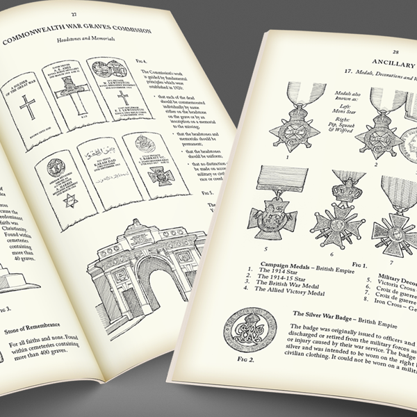
I was asked to develop a replacement student booklet on the Great War, that could be used by the company’s guides as a tool when out on touring the battlefields, besides being a useful aide memoir for the students. The concept was based on the style of British Army manuals of the period. The booklet’s content covers all the key points of the national curriculum in a visually interesting, tactile and useable format. For this reason it has been a great success with guides, teachers and students alike.


BEEZWINGZ PHOTOGRAPHY
My challenge was to develop an identity based upon an existing name that connected it to the business of photography. The only symbol used on a photographic lens in respect to ‘depth of field’ is that for "infinity" (symbol: ∞), so the solution was to create a bee whose wings are derived from the symbol for infinity.


BLETCHLEY PARK
Following the rebranding by Rose, Bletchley Park commissioned me to design a number of maps that could be used in different scenarios, from signage "You are here" totems, walking tour leaflets, to the Park's guidebook.


OPERATION MAXIM
The Operation Maxim identity was developed the the Metropolitan Police's anti people trafficking campaign. The logo utilised elements of highway signage to make it's message understandable across all languages.


BATTLE HONOURS
My mission was to develop a brand mark that would be instantly recognisable to British, Canadian, Australian and American customers. The solution was to crop the national flags down to a minimum that they still remained identifiable, and then to combine them in such a way as to make a unique symbol that would accompany a word mark.


UAV SURVEYS
This newly launched company produces surveys with pin point accuracy using a unmanned aerial vehicle (UAV). Besides the RAF roundel / target connotations. I was pushing against an open door when I presented this solution, as I later found out the company founder was confirmed Mod!

WESTERN FRONT ASSOCIATION
WESTERN FRONT ASSOCIATION
I was commissioned to evolve and update the Western Front Association logo besides giving creative direction to their website.


ARMY RESERVE
I was asked to update and digitize the Essex Yeomanry and 71 Signals Regiment cyphers in colour and in black and white, besides creating a recruiting leaflet and poster for 70 (Essex Yeomanry) Signal Squadron of the Territorial Army (TA), now the Army Reserve.

WAITROSE
With pen and ink, I hand drew the old Waitrose logo before the age of the Apple Mac!


POSTSLEEVE
To paraphrase another well know advertising slogan, this logo 'Does what it says on the tin" – it shows the product within the logotype!


FJG SOLICITORS
Fisher Jones Greenwood Solicitors required a new identity that reflected its professionalism, whilst at the same time looked modern and professional. It was implemented across all of its sign program and marketing communications too.


